The Real Reason Blue States Are Getting Hit Harder with COVID-19 than Red States
Why is that that red states are more anxious to re-open and return to life as we knew it than blue states hit by the coronavirus? Is it really politics or is there something else going on?
“You’re going to start to see over the course of the next six weeks or so a kind of red state-blue state divide in the United States where red states are going to open up at a much faster pace than blue states, and that’s going to have really interesting ramifications,” said White House economic adviser Stephen Moore on the Fox Business Network last month.
Here’s How Much Downstate New York Is Skewing the United States’ Coronavirus Numbers
There’s plenty of reason to believe that that politics is the driving factor. After all, it has been observed in polls that political affiliation has an impact on coronavirus polling on concern about the virus, attitudes towards social distancing, reopening the country, etc.
But we hear so much about the red state-blue state divide that one can’t help wondering how the coronavirus has impacted each state. So, let’s take a look. Based on data from the New York Times collected May 14 at 3:00 p.m. ET, of the ten worst states in terms of coronavirus cases per capita, all but one (Louisiana) voted for Hillary in 2016.
- New York (1.79%)
- New Jersey (1.61%)
- Massachusetts (1.16%)
- Rhode Island (1.14%)
- Connecticut (0.98%)
- Washington, D.C. (0.95%)
- Delaware (0.74%)
- Louisiana (0.72%)
- Illinois (0.67%)
- Maryland (0.60%)
We see a similar trend when we look at coronavirus deaths per capita. Only three of the top ten states voted for Trump. Two of those states, Michigan and Pennsylvania, voted for Barack Obama twice and could be more accurately described as purple states.
- New York (0.141%)
- New Jersey (0.112%)
- Connecticut (0.088%)
- Massachusetts (0.077%)
- Washington, D.C. (0.051%)
- Louisiana (0.051%)
- Michigan (0.047%)
- Rhode Island (0.044%)
- Pennsylvania (0.034%)
- Maryland (0.031%)
When it comes to death per capita, blue states are overwhelmingly the hardest hit. Of the top 25 states with the worst deaths per capita, only nine were states that voted for Trump. Why are blue states getting harder hit than red states? It’s not politics, it’s population density.
Here are the top ten worst states in coronavirus deaths per capita with their corresponding rank in terms of population density, with 1 being the most densely populated:
- New York (8th)
- New Jersey (2nd)
- Connecticut (5th)
- Massachusetts (4th)
- District of Columbia (1st)
- Louisiana (24th)
- Michigan (19th)
- Rhode Island (3rd)
- Pennsylvania (10th)
- Maryland (6th)
All but two states with the highest deaths per capita are in the top ten of states with the highest population density, and states with high coronavirus death rates are typically those with higher population density. In fact, when you look at the states ranked by population density, blue states tend to be on top, and red states tend to be on the bottom.
The correlation between population density and death rates can be observed not just in state comparisons, but at the local level as well. New York state is a great example of how the densely populated New York City area has been the hotspot for coronavirus activity, while the impact of the coronavirus on the rest of the state has been mild by comparison. More densely populated urban areas tend to be blue, while rural areas tend to be red.
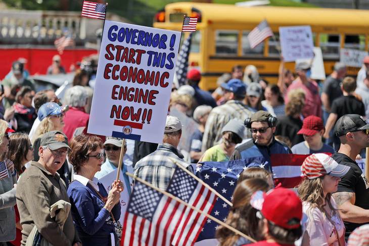
Red and blue America are experiencing two very different pandemics—not because of politics, but because of population density, and how that is impacting infections. People in rural America have the space to be able it implement social distancing easier than those in densely populated urban areas. This is why the one-size-fits-all approach to reopening doesn’t work, and why you’re seeing protests.

No comments:
Post a Comment